

Since the first TPI Sector Productivity Scorecards were released, the ONS has published a fresh year of productivity data, extending the series to 2025. We have also updated several underlying indicators with information from several complementary data sources. This makes it a timely moment to take a fresh look at what the scorecards tell us about productivity performance and drivers across UK sectors.
The updated indicators in this version are as follows:
- Labour Productivity: Output per Hour
- Labour Productivity: Output per Job
- Nominal Unit Labour Cost
- Average Labour Compensation
- Sickness Absence Rate
- Foreign Direct Investment per Job
- Innovation-active Firms
- New Business Births
- Share of Exporting Firms
If you missed the first blog introducing the Sector Productivity Scorecards, you can catch up on the motivation and benchmarking approach here. With an additional year of productivity data, we can now start to see whether earlier sector trends are strengthening, stalling, or reversing across sectors. This update also reflects some changes to the scorecard methodology and visual modifications which improve its transparency.
The headline picture is one of limited overall growth. UK median has grown by 0.98%. less than a per cent. Median labour productivity across sectors rose to £40.63 per hour in 2025, up from £38.83 (£40.23 in 2025 prices) in the 2024 release. That is an increase of just under 1 per cent – an increase of 0.98%.
This slow median growth provides useful context for judging which sectors are pulling ahead of or falling behind the pack. Since 2019 (pre-pandemic), sector performance has varied widely.
The strongest performers since 2019 are:
J - IT & Communication — +33.2%
A - Agriculture — +24.6%
M - Professional Services — +16.2%
C - Manufacturing — +10.9%
N - Administrative Services — +10.3%
H - Transportation & Storage — +7.1%
F - Construction — +5.1%
IT and Communication is the clear leader, with productivity growth of more than 30 per cent since 2019. This reflects the strength of a knowledge- and innovation-intensive sector that can scale output without equivalent increases in labour or capital.
Agriculture also stands out. Although it remains a low-productivity sector in level terms, it has recorded the second-fastest growth rate since 2019.
Several sectors are broadly in line with the UK average:
E - Water & Waste — +2.4%
O - Public Administration — +0.4%
R - Arts & Entertainment — -1.8%
G - Wholesale/Retail — -1.8%
I - Hospitality — -4.5%
P - Education — -4.5%
These sectors show modest growth or decline, rather than the sharp falls seen elsewhere. Hospitality and Arts and Entertainment, for example, remain close to the UK average despite the disruption these sectors have faced since the pandemic.
The weakest performers are:
S&T - Other Services — -6.6%
L - Real Estate — -10.4%
K - Finance & Insurance — -10.4%
Q - Health & Social Work — -11.1%
B - Mining — -26.0%
D - Energy Supply — -52.3%
The sharpest decline is in Energy Supply, where productivity is more than 50 per cent below its 2019 level. Mining also shows a substantial fall. These results are particularly striking because both sectors remain highly productive in absolute terms.
The scorecards show why it is important to look beyond headline productivity levels. Some sectors with high productivity levels are not necessarily growing strongly, while some lower-productivity sectors are improving quickly.
Looking at pre-pandemic productivity growth (2019-2025) as well as absolute growth lets you see the full picture of sector productivity in the UK:
Beyond Output per Hour: What Else Drives Productivity
The headline productivity figures - output per hour, output per job - tell you how sectors are performing, but they do not explain why. The wider scorecard indicators help identify the drivers behind the headline figures.
The sector scorecard includes indicators on:
Direct Inputs — the tangible resources of production
Indirect Inputs — the enabling environment
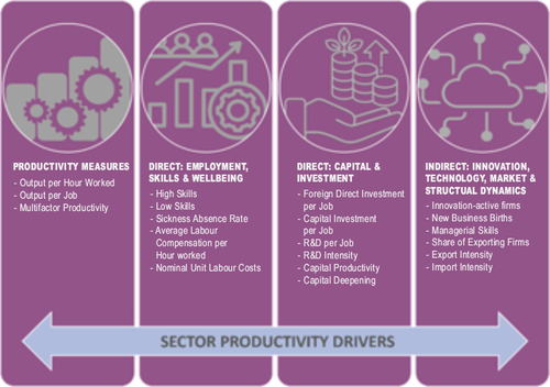
This broad view matters. For example, Energy (Electricity & Gas) Supply's steep decline turns out to be a genuine efficiency problem, not a maturing capital stock. Capital Investment per Job rose 32% (2019-2024) while Capital Productivity fell 26% and Multifactor Productivity fell 27% over the same period.
Agriculture tells a different story. Its strong pre-pandemic growth points to a labour-shedding story rather than an investment-led one: employment share fell from 11.2% to 10.0% between 2019 and 2024, alongside a 26% rise in average labour compensation and Multifactor Productivity gains over the same period; consistent with a smaller, better-compensated workforce driving output per hour higher.Its strong pre-pandemic growth, meanwhile, isn't investment-led. Foreign Direct Investment per Job is small and falling (£8,577 to £5,660, 2021-2024). Instead, the data point towards a labour-shedding story, with employment share down from 11.2% to 10.0% alongside a 26% rise in average labour compensation and genuine Multifactor Productivity gains.
Electricity & Gas Supply (D) offers a useful case study, because the headline ranking tells a very different story from the underlying trend.
On the surface, the sector looks strong: it's the UK's 2nd most productive sector by output per hour in 2025, at £166.88/hour - more than four times the UK median of £40.63/hour. The reason is partly structural: the sector is highly capital-intensive, contributes just 1.4% of UK GVA and employs only 0.4% of the total workforce, so a relatively small, highly capitalised workforce generates a very high output-per-hour figure.
But look at the direction of travel and the picture changes. Electricity & Gas Supply recorded the steepest year-on-year fall of any sector in 2025, down 11.4% - and this isn't a one-off. The 2024 release already showed the sector shrinking 2.5% over the previous year and down 14.9% over the preceding five years (the second worst of all 19 sectors). Zooming out further, the 2025 data places the sector dead last (19th of 19) in the pre-covid productivity growth ranking, with output per hour down 52.3% relative to its pre-pandemic trajectory.
Feedback on our scorecards is always valuable as it allows us to make modifications that we know users will appreciate. Presenting a vast amount of data in the compact form of a scorecard means every indicator must justify its space, so where an indicator raised more questions than it answered, we've reworked or removed it. With this in mind, we've removed Cost of Capital and Job Intensity of Output: both attempts to capture genuinely complex topics that don't lend themselves to a clear, single-figure summary in this format.
Another key change: for indicators where the sector value is already a percentage, growth is now expressed in percentage points rather than a percentage change. Taking a percentage of a percentage produced volatile, hard-to-interpret growth figures; percentage points give a more accurate, and more intuitive, representation of change in this context.
The TPI Sector Productivity Scorecard has been developed as a diagnostic and decision-support tool. They help users assess sector productivity performance and identify possible drivers of productivity strengths and weaknesses across various sectors in the UK. It focuses on productivity inputs rather than attempting to compare sectors directly, as many metrics are not comparable across different sectors. Here are some suggestions of how they can be used by various audiences.
For a more in-depth analysis and clean visualisations showcasing this dataset, see the interactive TPI UK Sectoral Productivity Dashboard under the tools section of our website.