

By Raquel Ortega-Argilés, William Sarsfield, Nathan McKeogh, Olga Menukhin
Revising the Sectoral Productivity Dashboards starts from a simple recognition: dashboards are only as valuable as the insights they allow users to uncover. The earlier version of the dashboard was built on the TPI UK Sectoral Productivity Scorecards, which provide a rich set of productivity indicators across 19 UK industries.
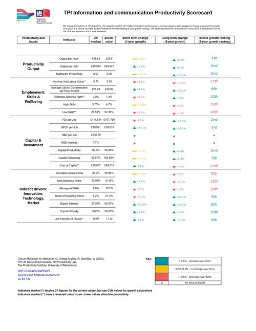
The revised version of the dashboards is built directly on the scorecard foundation but significantly extends its analytical power. Instead of presenting the indicators as standalone metrics, they transform the scorecards into an interactive system that links productivity outcomes with their underlying drivers. This change enables policymakers, researchers and industry practitioners not only to compare sectors but also to understand why productivity differs across sectors and how those differences change over time.
A central innovation in the revised dashboards is the move from structured scorecards to integrated sectoral stories. The TPI UK Sectoral Scorecards were designed around a production-function logic, grouping indicators to inputs, such as labour or intangibles, that shape productivity performance. Users had to interpret individual metrics—such as output per hour, foreign direct investment, or capital formation—largely in isolation. The updated approach brings these elements together into coherent narratives that highlight how different drivers of productivity interact. For example, the Information and Communication sector emerges clearly as a high-performing, capital-intensive and high-wage sector, where strong investment aligns with strong productivity outcomes. In productivity performance, the sector ranks 1st in the UK for output per hour and 3rd for output per job. GFCF per job ranks 1st, FDI per job 3rd, and capital productivity 2nd — a picture of a highly capitalised, highly productive sector that attracts significant investment. Labour compensation per hour ranks 3rd, consistent with a high-wage, high-skill workforce. We also see, however, a decline in the number of highly skilled individuals in the workforce; this may be due to various factors and warrants investigation.
For policymakers and practitioners, this combined view is particularly valuable as it transforms the framework from a diagnostic list into a causal narrative tool, helping to identify which combinations of inputs drive industrial productivity performance.
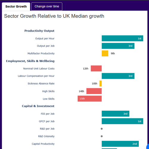
The scorecards—available as individual sector reports—provide detailed benchmarking of sector performance against UK median growth rates. They help identify whether sectors are above, below, or in line with national productivity trends. However, their static format limits exploration.
The dashboards address this by introducing a more intuitive structure that guides users from the overview to the details. The new layout separates the dashboard into complementary components: a high-level overview of sectoral footprint and geography, and a deeper dive into performance indicators. This improves navigation and reduces the analytical burden on users, who can now quickly grasp both the scale of a sector and the drivers behind its performance. What was once a more fragmented experience is becoming a clearer analytical journey, making the dashboards significantly more accessible to non-specialist audiences. Now, users can start with the big picture and progressively uncover deeper insights.
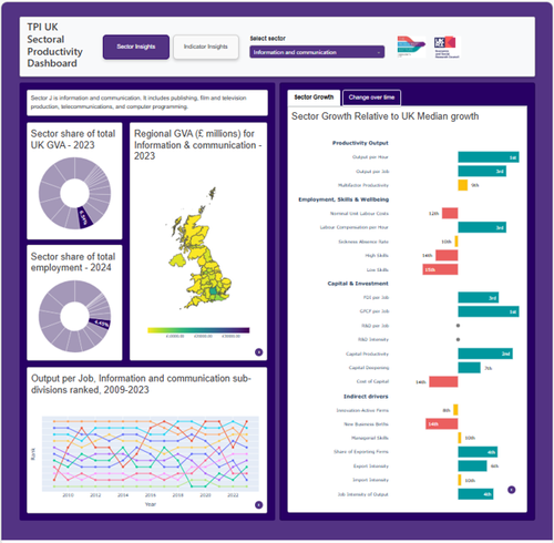
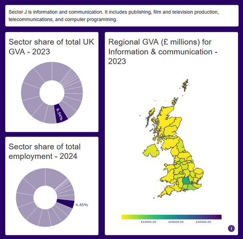
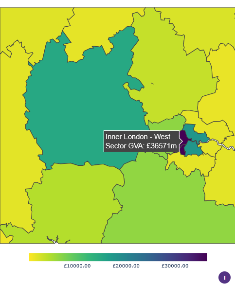
One limitation of the scorecards is their primary focus on industrial productivity. The industrial interactive dashboards integrate geography into the analytical framework. Productivity is no longer presented as an abstract sectoral outcome but as something that is rooted in place. The inclusion of regional GVA maps and sectoral footprint indicators allows users to see where economic activity is concentrated and how it is distributed across the UK. In the case of Information and Communication, the dashboards highlight the overwhelming dominance of Inner London West, which alone accounts for a substantial share of the sector’s output. This spatial perspective is critical for policy, as it underscores the extent to which productivity challenges are also regional challenges, requiring place-based interventions rather than one-size-fits-all solutions.
The scorecards provide a powerful benchmarking tool, comparing sectoral growth performance over a five-year period using consistent indicators. However, they are less suited to capturing long-term structural change.
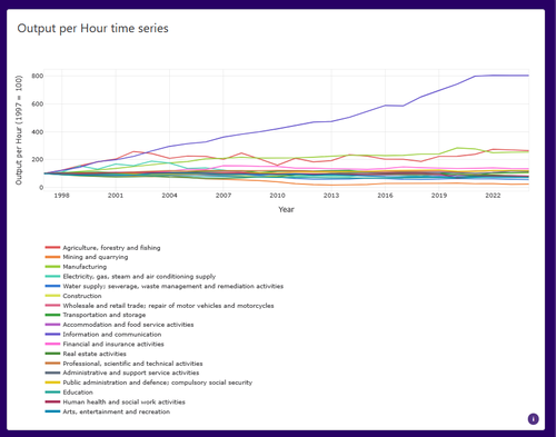
The revised dashboards also place much greater emphasis on dynamics over time. Instead of offering only static snapshots, they allow users to trace long-term trends in productivity and sectoral change. This reveals not only success stories but also patterns of stagnation and decline. For instance, while Information and Communication has experienced sustained and dramatic productivity growth since the late 1990s, many other sectors have seen little progress—or even declines—over the same period. By making these trajectories visible, the dashboards help shift the conversation from short-term performance to long-term structural change.
The scorecards already emphasise the importance of underlying drivers, including labour inputs (skills and employment), capital and investment, innovation and business dynamism and market exposure and trade.
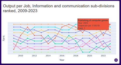
The revised dashboards take this further by introducing sub-sector analysis, which adds an important layer of granularity. Sectors are no longer treated as homogeneous entities; instead, users can explore how different activities within a sector evolve. This makes it possible to identify emerging growth areas and diagnose sector-specific bottlenecks more precisely. For example, strong innovation activity or export intensity may coexist with weak capital productivity or labour shortages—highlighting targeted areas for intervention.
In the Information and Communication sector, the rapid rise of computer game publishing—from near the bottom of the productivity rankings to the top within its sector—illustrates how innovation and technological change can reshape performance.
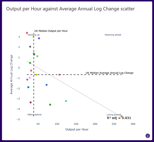
The analytical capabilities of the dashboards have also been strengthened through the introduction of comparative tools, particularly the indicator insights page and associated visualisations. These allow users to examine relationships between variables and compare performance across sectors more systematically. Scatter plots, for example, make it possible to identify broader trends—such as the troubling pattern that more sectors appear to be falling behind in productivity than catching up—as well as to spot outliers like Mining and Quarrying, which maintain high output despite long-term decline. This shift from descriptive statistics to relational analysis significantly enhances the dashboards’ value as a diagnostic tool.
The scorecards’ benchmarking approach – comparing sectors against UK median performance – provides a clear picture of relative strengths and weaknesses.
The dashboards extend this by introducing comparative dynamic tools, such as the indicator insights page and scatter plots. These allow users to explore relationships between variables and compare sectoral performance more systematically.
This reveals broader patterns across the economy. For instance, the data suggests that more sectors are falling behind in productivity than catching up, while a few high-performing sectors pull ahead. At the same time, outliers such as Mining and Quarrying illustrate how sector-specific dynamics can yield unexpected results.
These tools transform the dashboards into a diagnostic platform, rather than a purely descriptive one.
The revision of the Sectoral Productivity Dashboards represents a significant evolution in how productivity data is used. The original scorecards already provided a robust, evidence-based framework grounded in a production-function approach and a wide set of indicators.
What the dashboards add is a new layer of interpretation: interactivity, visual integration, geographic context, and dynamic analysis. Together, these improvements transform the scorecards from a static benchmarking tool into a comprehensive decision-support system.
Ultimately, the revised dashboards do not replace the scorecards—they bring them to life. By turning structured data into actionable insight, they provide a stronger foundation for tackling the UK’s productivity challenges in a more targeted and informed way.
Follow our website to learn more about new productivity data tools and insights: https://lab.productivity.ac.uk